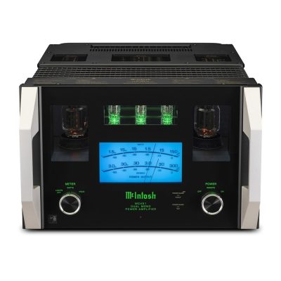
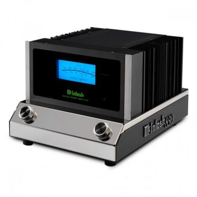
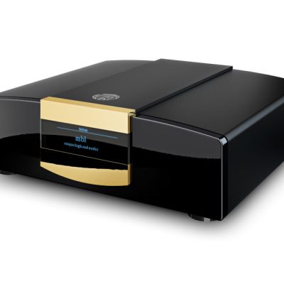
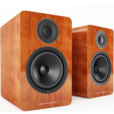
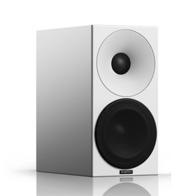
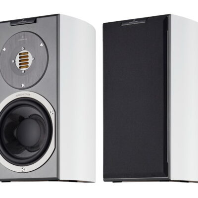
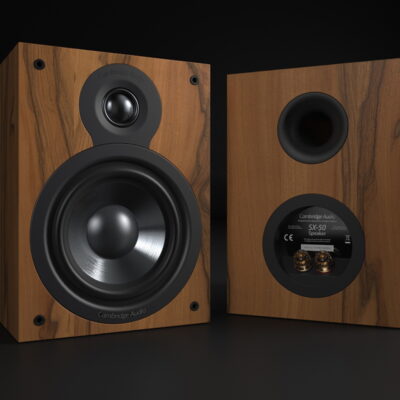
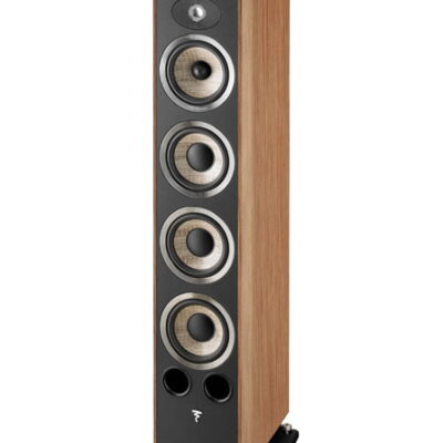
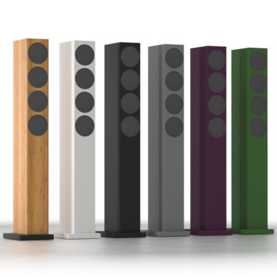
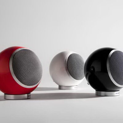
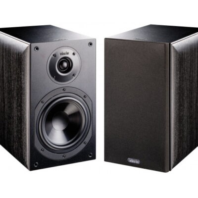
Upgrade to HiFi24 Premium Upgrade to HiFi24 Premium: Limited Lifetime Offer! Exclusive launches, new products, juicy news and limited-time offers you won't find anywhere else. Choose your plan Trending Categories Speakers Amplifiers DACs Turntables CD Players Network Player Speaker Cables Mini speakers Headphones Earpods Buy Now 15% Off Five bold colors $99 each From $290.00 Buy Now 15% Off Five bold colors $99 each From $290.00 Buy Now 15% Off Five bold colors $99 each From $290.00 Buy Now 15% Off Five bold colors $99 each From $290.00 Buy Now 15% Off Five bold colors $99 each From $290.00 Buy Now 15% Off Five bold colors $99 each From $290.00 Trending Products Featured productsNew products AmplifiersMCINTOSH MC4510 out of 5 Brand: Mcintosh Read more Continue Loading Done CompareQuick ViewBuy Now AmplifiersMCINTOSH MC 8300 out of 5 €7.800,00 Brand: Mcintosh Add to cart Continue Loading Done CompareQuick ViewBuy Now AmplifiersMBL C 210 out of 5 €7.900,00 Brand: Mbl Add to cart Continue Loading Done CompareQuick ViewBuy Now AmplifiersMAGNUM DYNALAB DYNAMYTE HYBRID POWER AMP0 out of 5 €3.090,00 Brand: Magnum Dynalab Add to cart Continue Loading Done CompareQuick ViewBuy Now AmplifiersMAGNUM AUDIO MOSTONE0 out of 5 €830,00 Brand: Magnum Audio Add to cart Continue Loading Done CompareQuick ViewBuy Now AmplifiersM2TECH LARSON0 out of 5 €2.999,00 Brand: M2tech Add to cart Continue Loading Done CompareQuick ViewBuy Now No more Products to displayView More Products Best Selling Products Best Selling Products SpeakersACOUSTIC ENERGY AE 1 Active0 out of 5 €1.499,00 Brand: Acoustic Energy Add to cart Continue Loading Done CompareQuick ViewBuy Now SpeakersAMPHION Helium 4100 out of 5 €850,00 Brand: Amphion Add to cart Continue Loading Done CompareQuick ViewBuy Now SpeakersAUDIOVECTOR R1 Avantgarde0 out of 5 €4.800,00 Brand: Audiovector Add to cart Continue Loading Done CompareQuick ViewBuy Now SpeakersCAMBRIDGE AUDIO SX 500 out of 5 €240,00 Add to cart Continue Loading Done CompareQuick ViewBuy Now SpeakersFOCAL-JM LAB Aria 9360 out of 5 €3.298,00 Add to cart Continue Loading Done CompareQuick ViewBuy Now SpeakersDO ACOUSTICS Armonia Mundi Impact0 out of 5 €2.950,00 Add to cart Continue Loading Done CompareQuick ViewBuy Now SpeakersELIPSON Planet M0 out of 5 €550,00 Add to cart Continue Loading Done CompareQuick ViewBuy Now SpeakersINDIANA LINE Nota 260 X0 out of 5 €299,00 Add to cart Continue Loading Done CompareQuick ViewBuy Now SpeakersKLH Model Five0 out of 5 €3.290,00 Add to cart Continue Loading Done CompareQuick ViewBuy Now Buy Now 15% Off Five bold colors $99 each From $290.00 Buy Now 15% Off Five bold colors $99 each From $290.00 Buy Now 15% Off Five bold colors $99 each From $290.00